Environment branding:
The Rocks
Sydney’s social, creative and cultural centre.
Brand story
The Rocks is one of Sydney’s most iconic districts: A vibrant creative hub steeped in history and loved by visitors and locals alike.
This project originally stemmed from a need to review the efficiency of wayfinding at both The Rocks and Darling Harbour districts in Sydney. During the exploration stage, the wayfinding agency recognised that environment branding and design could play a much more impactful role, and collaborated with Brave on developing this aspect of the project.
-
The key challenge here was to develop brand propositions that were already established for both districts. Each district needed its individual personality, but needed to align with the other through the use of similar templates and typography, allowing for a cohesive wayfinding system.
-
Brand toolkit: Identity design; colour palette; photography art direction; grid systems and templates; visual language guides for marketing collateral and socials; tone of voice and copywriting.
-
Environment branding/Arts and culture/Tourism
Brand toolkit
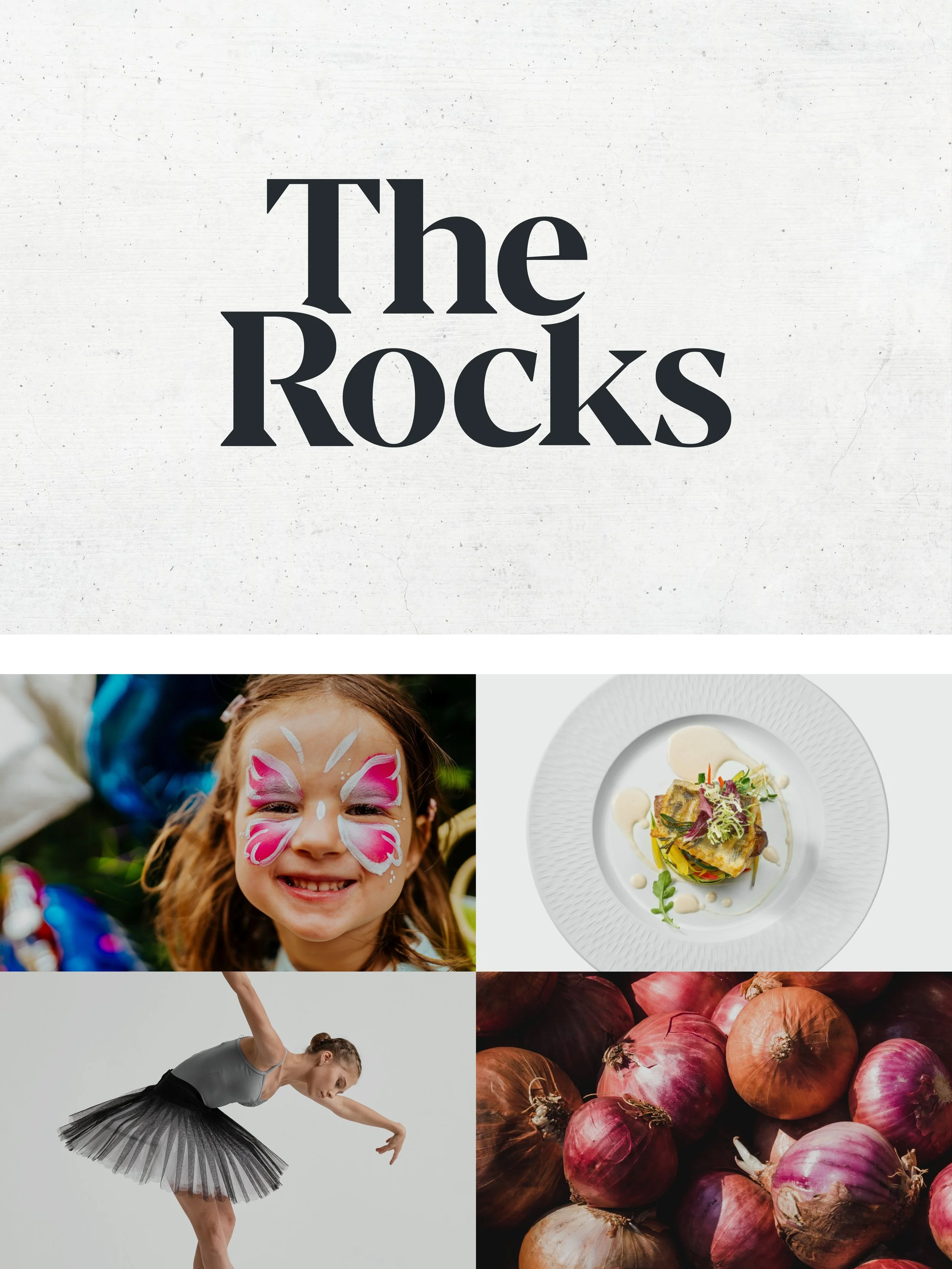
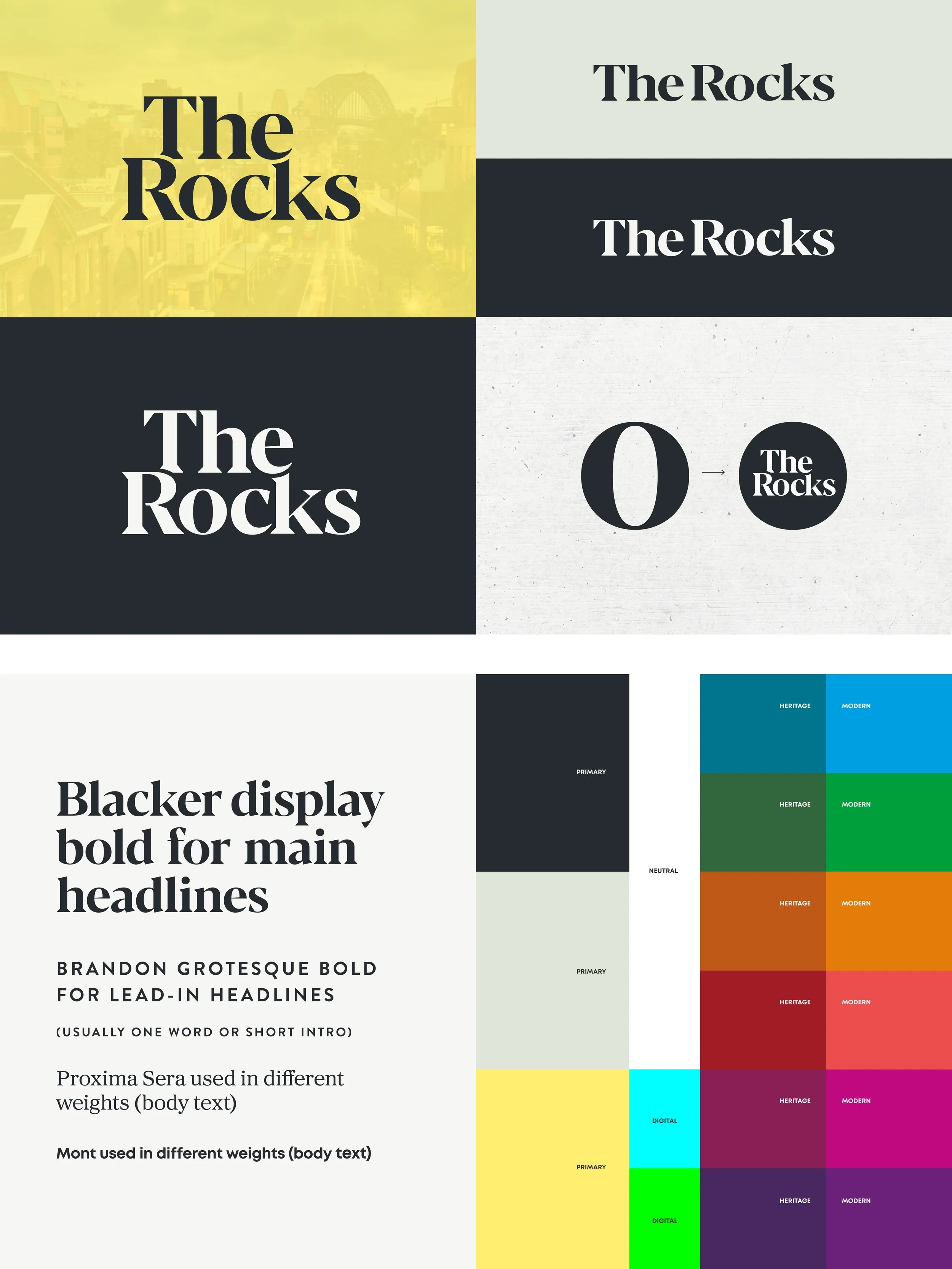
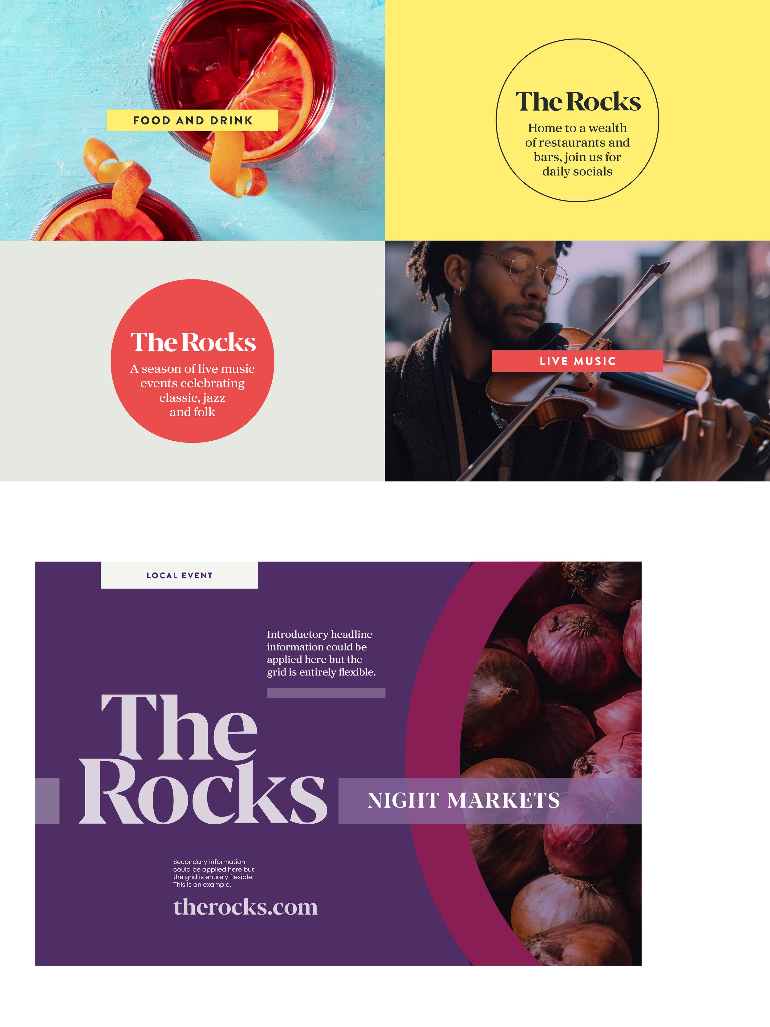
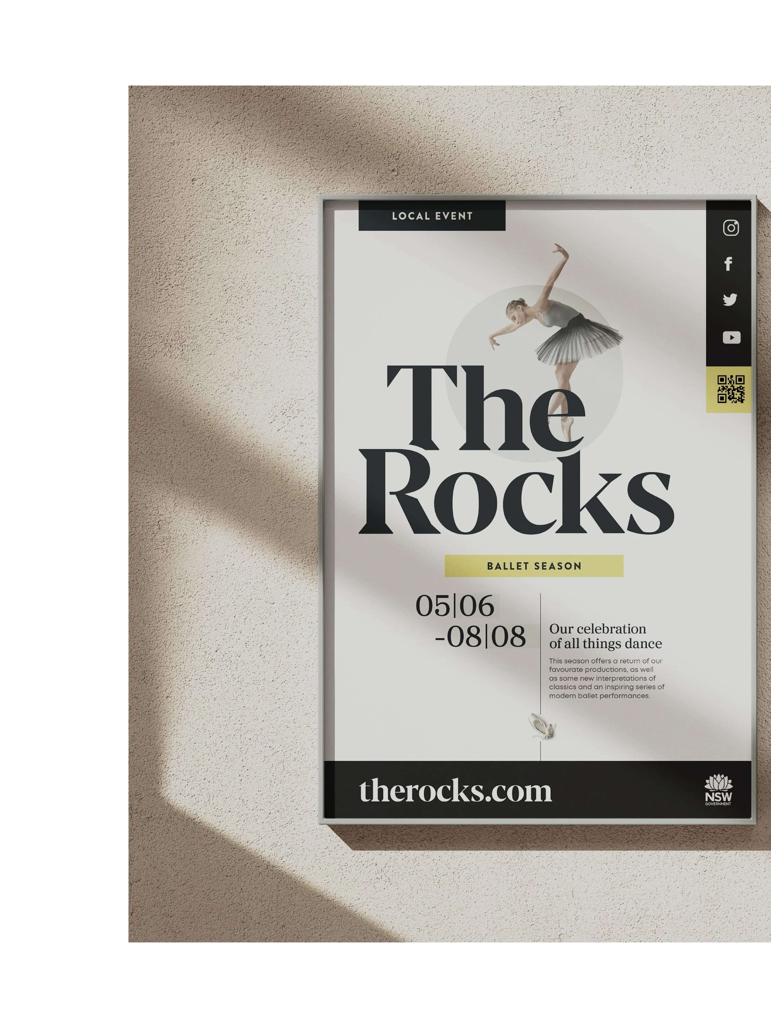
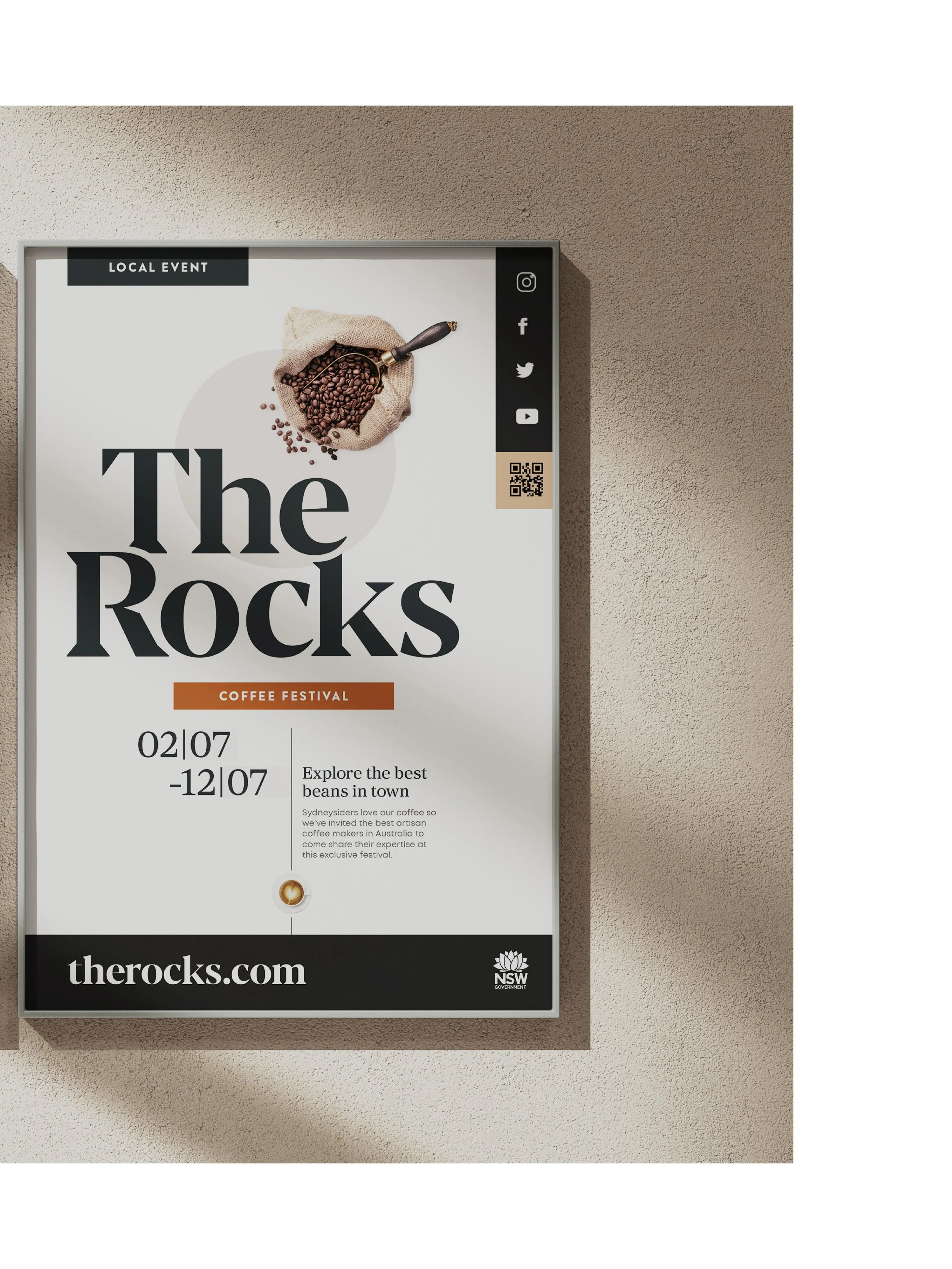
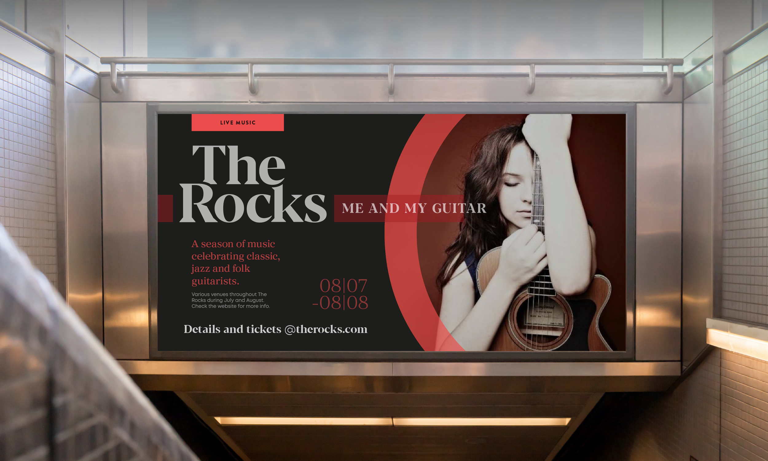
An impactful word-mark; a more vibrant colour palette; photography art direction and an updated brand font collection, balancing classic and contemporary.
Visual language and application
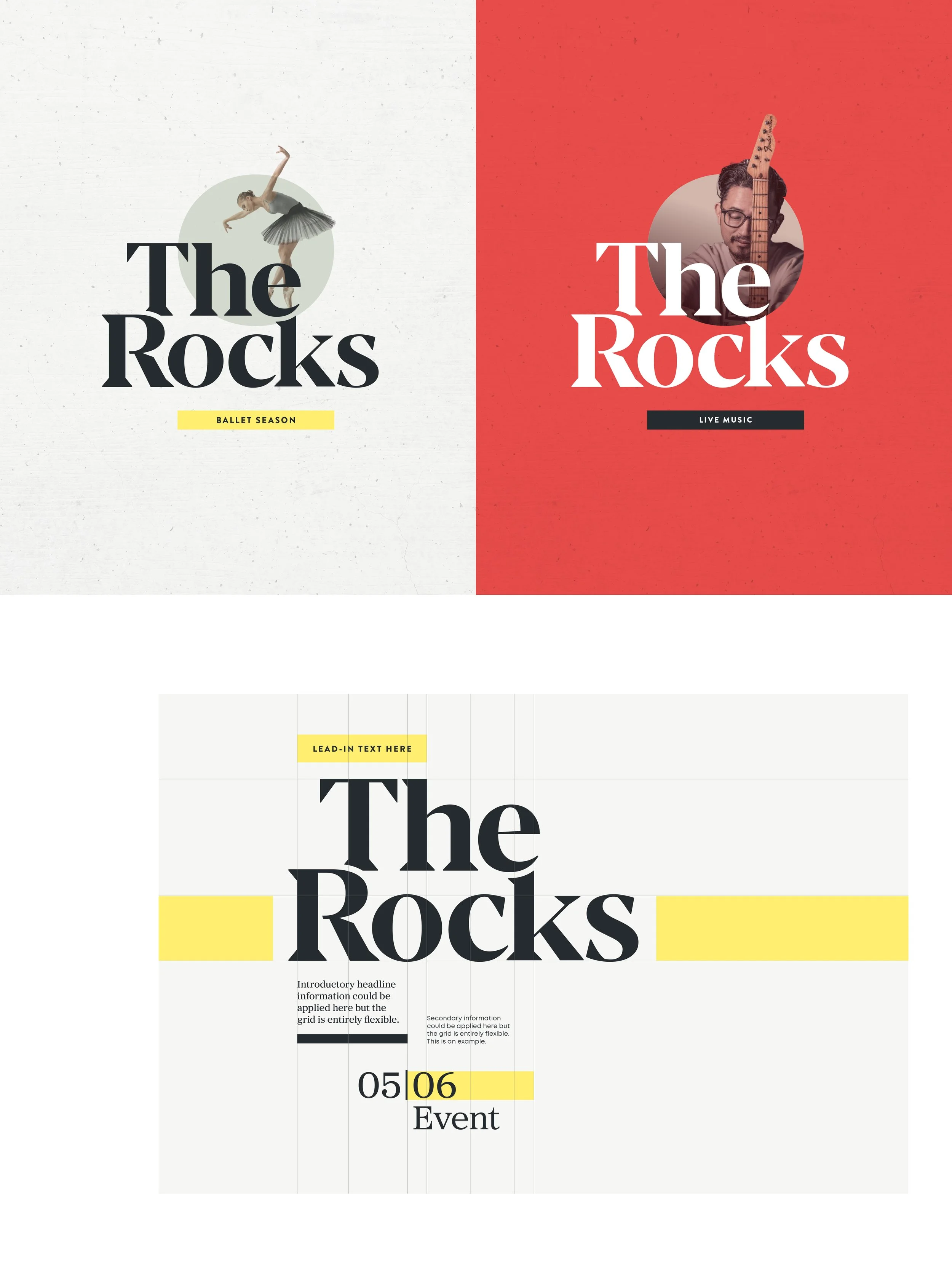
A robust visual language system incorporating the assets above, including layout grids for templates and treatments for cohesive communications at all scales, in print or digital.
Environment branding:
Darling Harbour
A globally renowned
visitor attraction.
Brand story
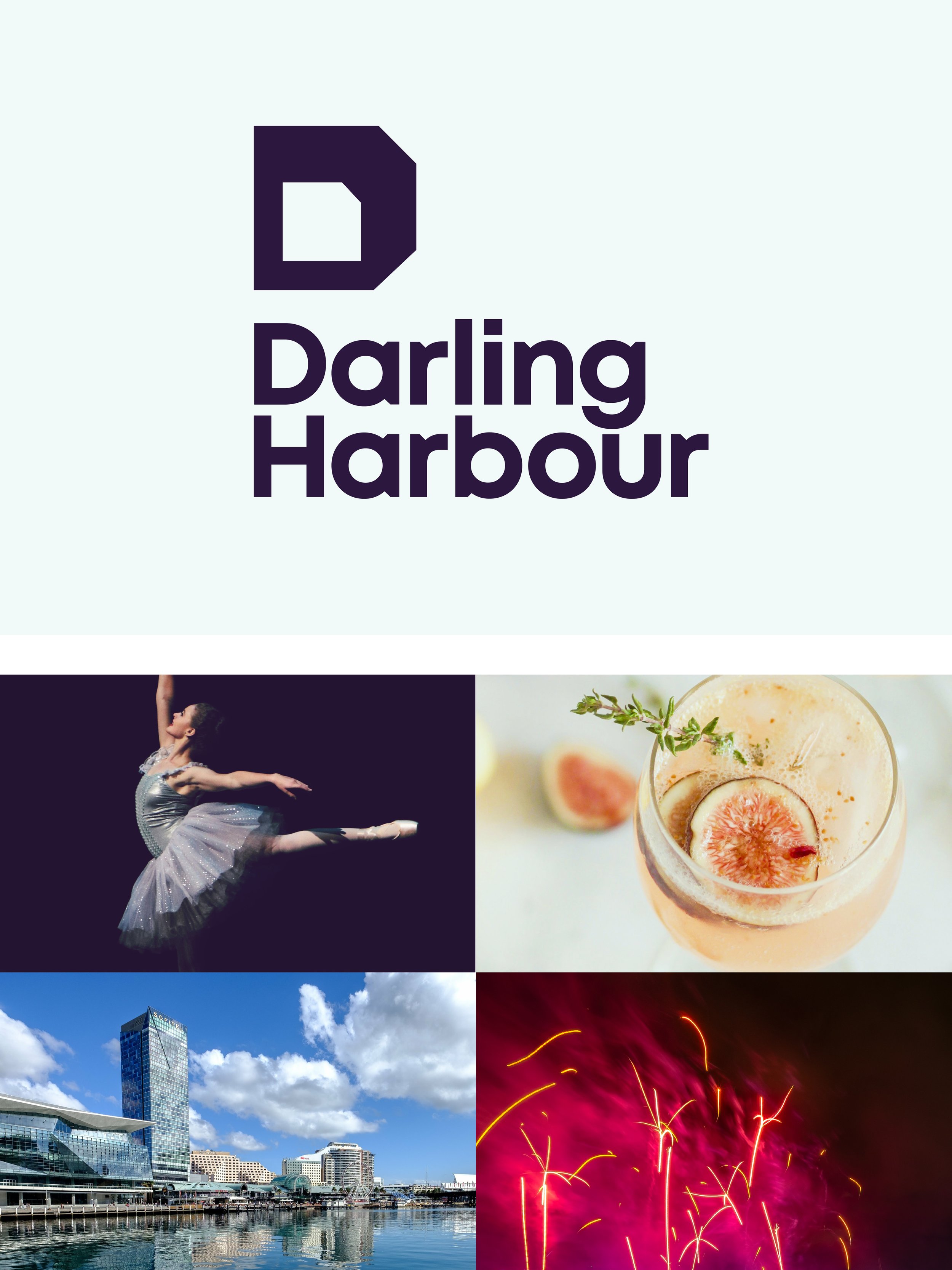
Darling Harbour is Sydney’s business and entertainment centre, with the ICC and harbourside location attracting visitors in their thousands.
The sister project to The Rocks, the need here was to create a confident and impactful brand system befitting of the location, with the gravitas to appeal to a global audience. Utilising the strap line ‘Sydney’s connected heart’, the brand identity took influence from a polaroid photograph frame, literally forming the framework for the visual language and wayfinding going forward.
-
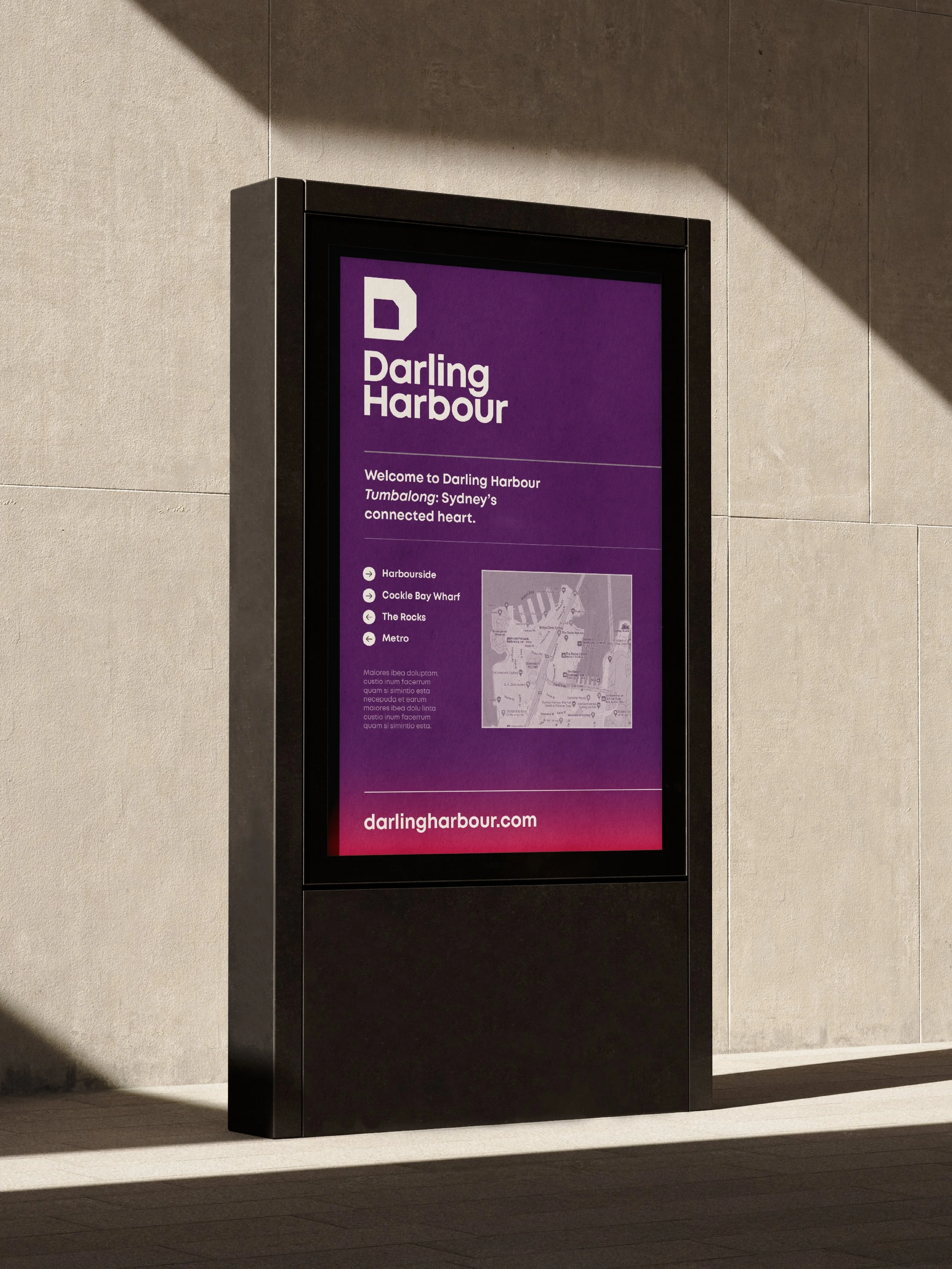
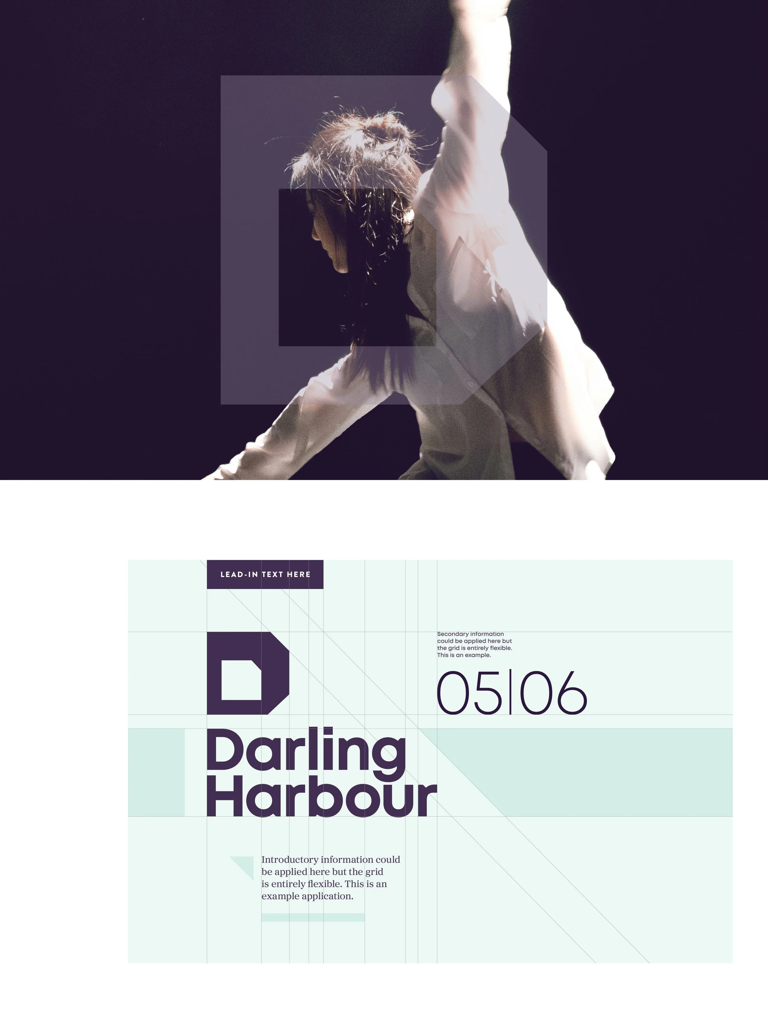
The key challenge here was to align this brand’s visual language with that of The Rocks. Using The Rocks’ typography, grid systems and templates, it was possible to create an information methodology that aligned both districts, allowing for a cohesive wayfinding system as per the original brief.
-
Brand toolkit: Identity design; colour palette; photography art direction; grid systems and templates; visual language guides for marketing collateral and socials; tone of voice and copywriting.
-
Environment branding/Arts and culture/Tourism
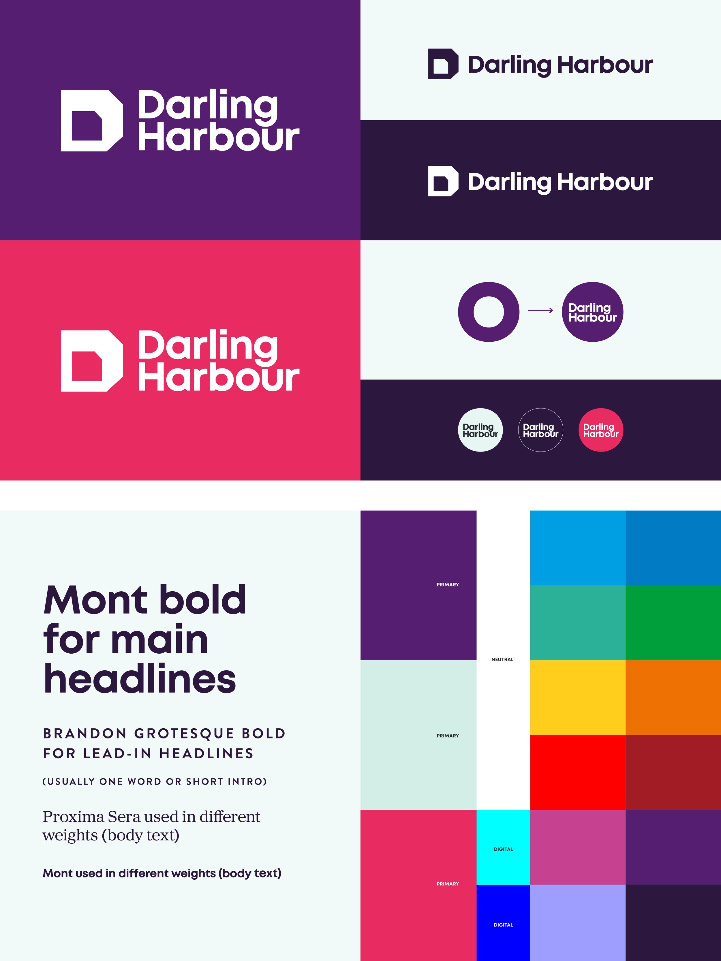
Brand toolkit and visual language
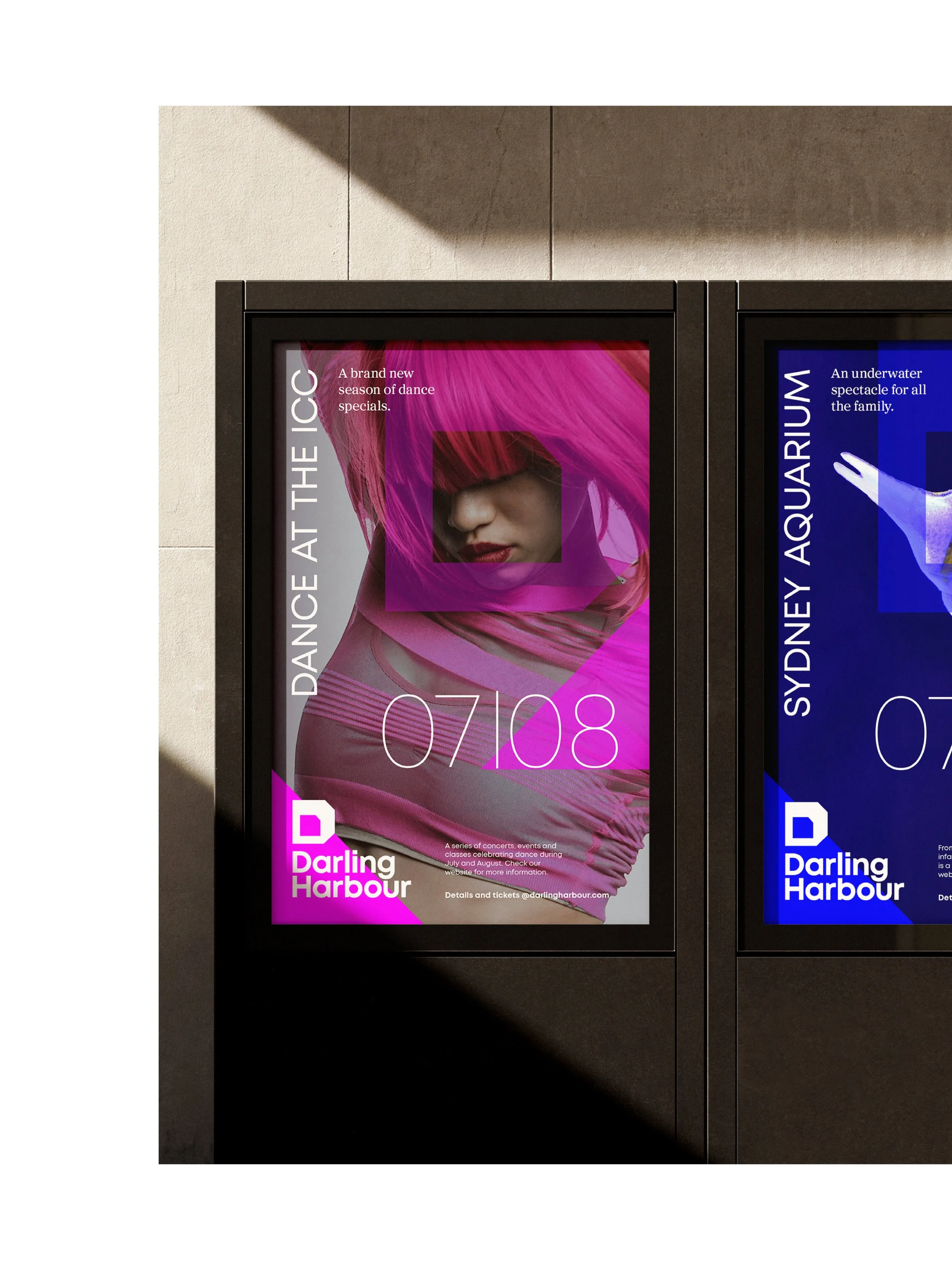
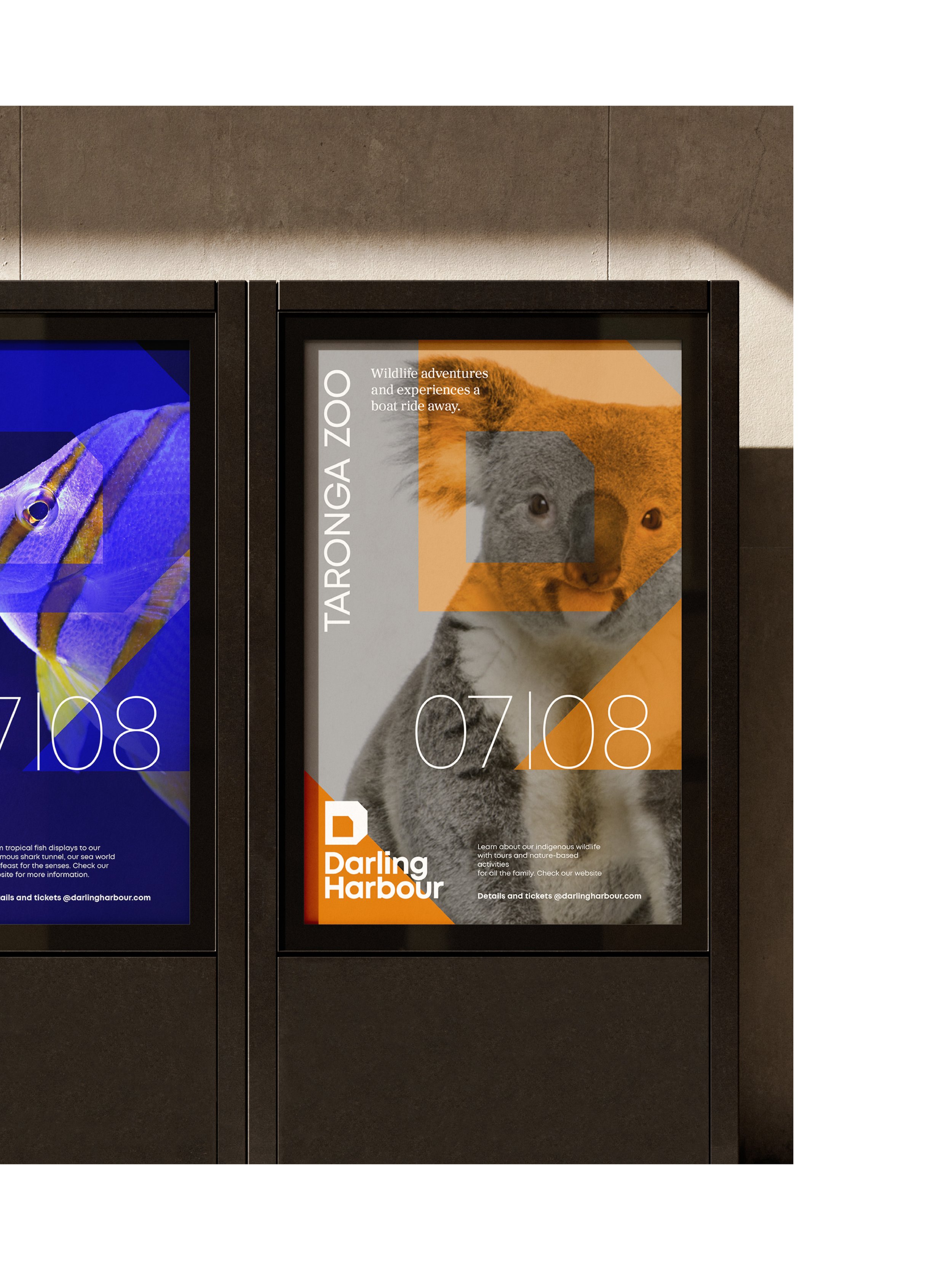
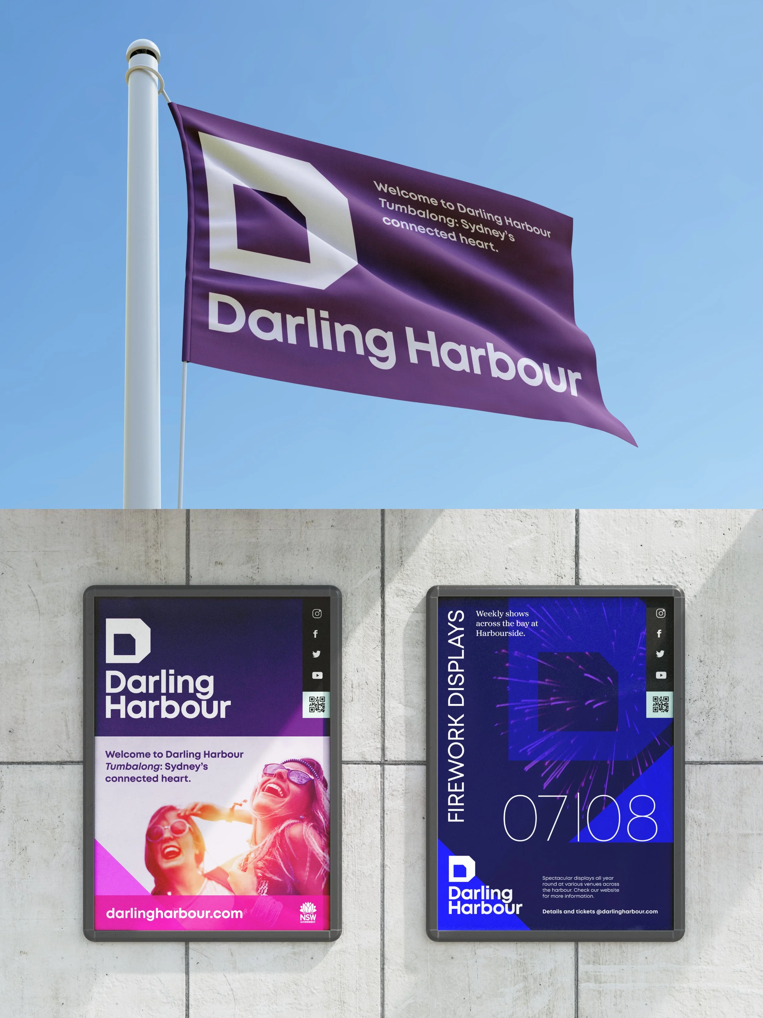
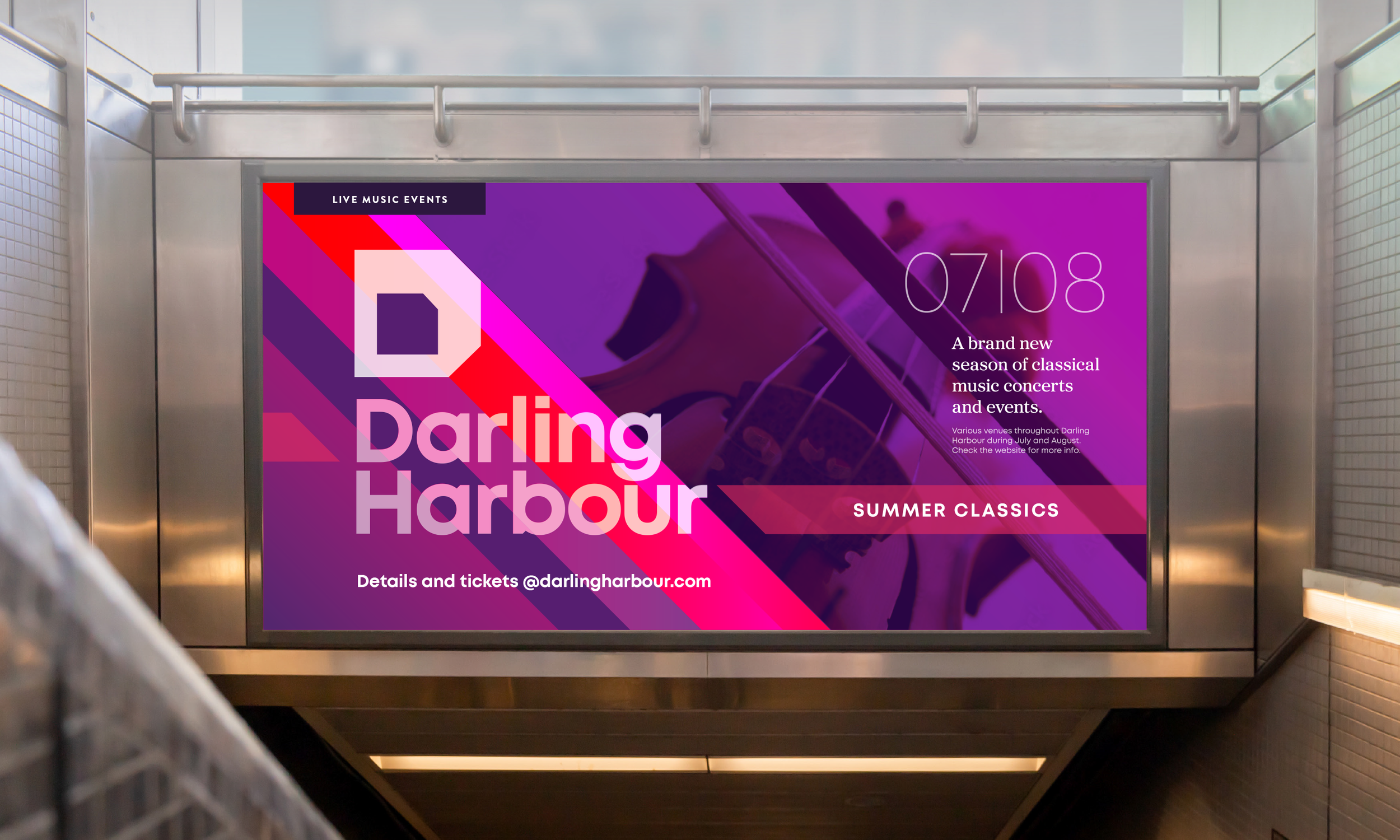
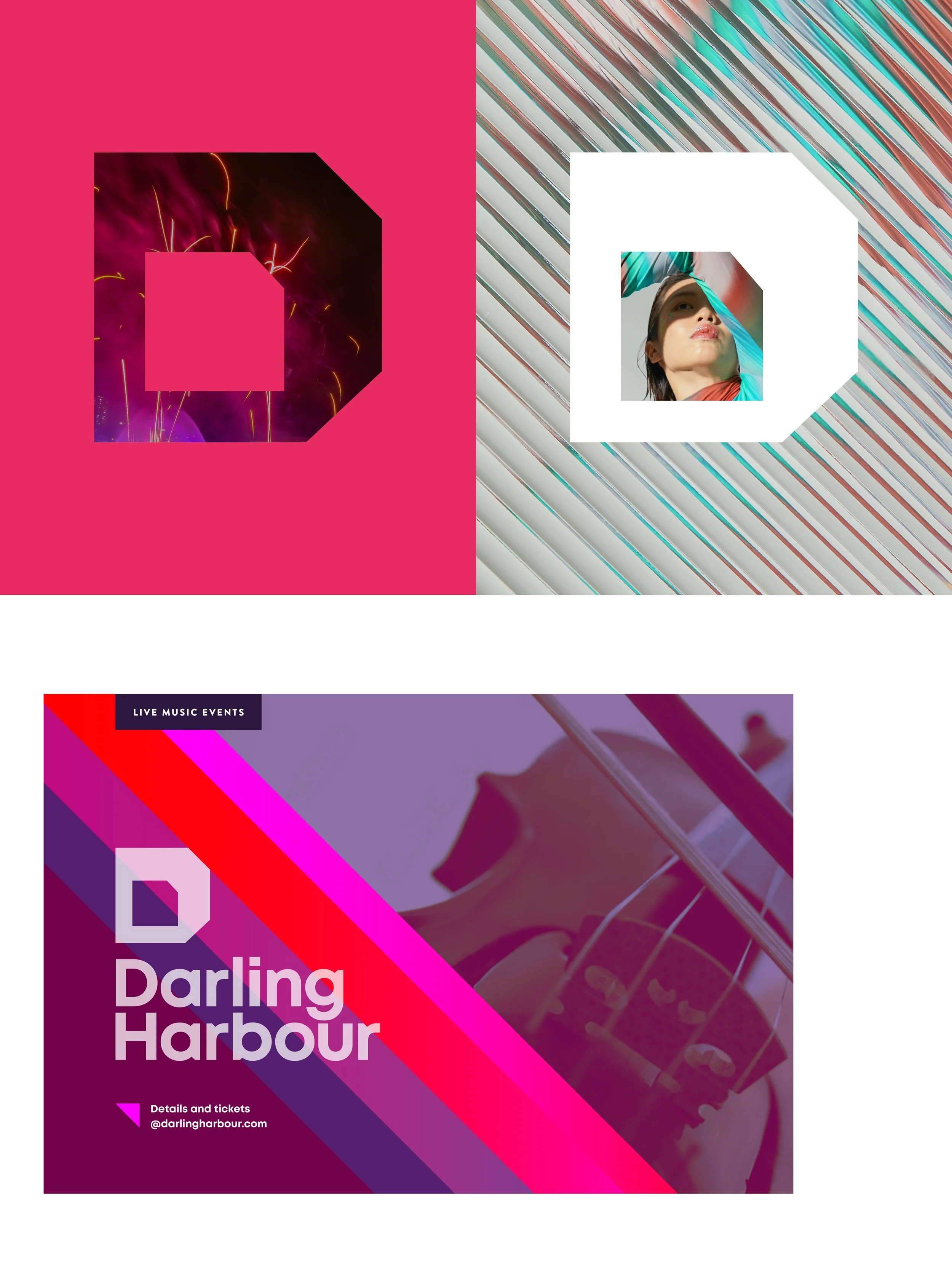
A dynamic brand identity; vibrant colour palette; brand font collection aligning with The Rocks; photography art direction and an unique treatment of the ‘D’ logo to highlight the district’s memorable activities and experiences.
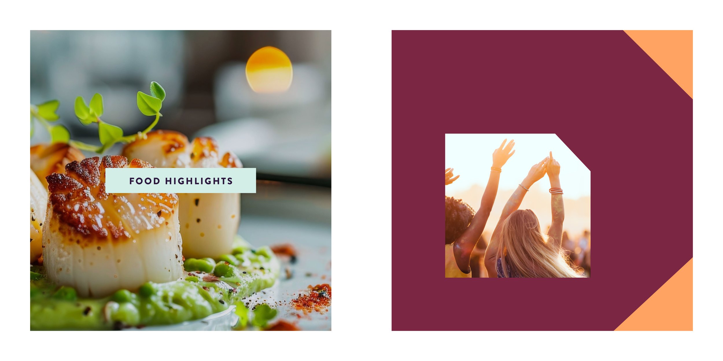
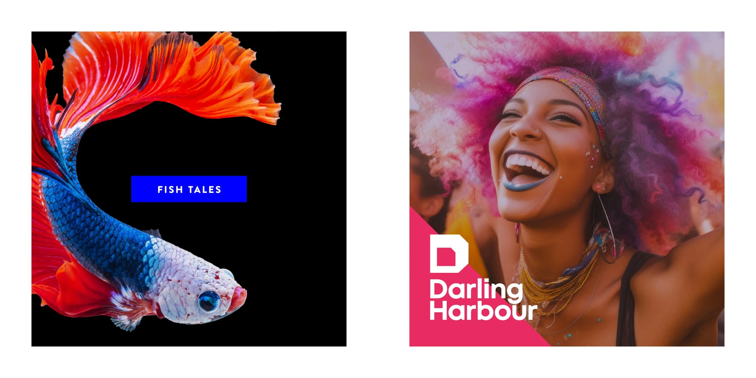
The brand applied
The use of the brand toolkit and templated grids brings the brand to life – creating a uniquely recognisable suite of promotional materials and wayfinding solutions.